Why mobile design changes the way live entertainment works
Phones changed more than where people go online. They changed how much patience users have for awkward screens. A desktop monitor can hide weak design because there is space for extra menus, side panels, and oversized controls. A phone cannot. Everything has to earn its place. Live entertainment makes that especially clear. Video needs room, buttons have to be easy to tap, and the user still needs a quick way to move around the page. If the pieces compete for space, frustration quickly sets in. In mobile first designs, the challenge is overcome since the smaller screen is seen as the basis instead of as the downgraded version of the desktop. This principle can be seen at work in live casino designs.
A small screen forces better priorities
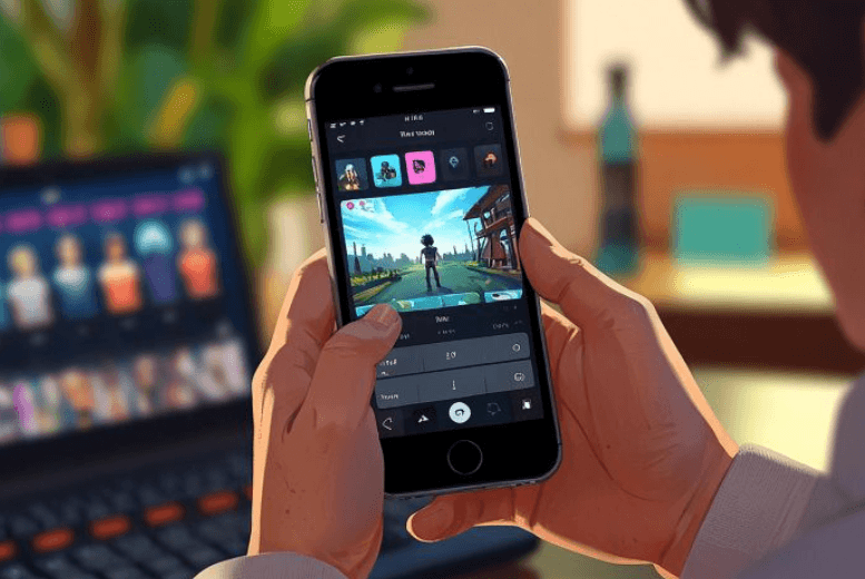
There is no spare corner on a phone. The main activity has to stay visible while secondary information moves somewhere less intrusive. That becomes especially relevant with a format such as a desipaly indian live casino app, where live video and interactive controls share the same limited space.
A desktop version might place several categories, game information, account options, and navigation around the central stream. Copying that layout directly onto a phone would make everything tiny. Mobile design works differently. The table or video gets most of the attention. Less immediate information can sit inside compact menus or expandable areas.
This creates a cleaner screen without removing useful functions. The user sees what matters at that moment, while everything else remains available when needed.
Fingers changed the way buttons are designed
A mouse pointer is precise. A thumb is not. That physical difference has shaped mobile interfaces for years.
Tiny buttons may look neat in a mockup, but they become irritating once someone tries to use them while holding a phone. Controls need enough room around them so one tap does not trigger the neighboring option. Placement matters too. Frequently used actions should not sit in a corner that requires an uncomfortable stretch every time.
A few practical mobile habits make live interfaces easier to use:
- Leave Enough Space Between Common Controls.
- Keep Frequently Used Actions Within Comfortable Reach.
- Avoid Long Rows Of Tiny Buttons.
- Use Labels That Stay Readable Without Zooming.
- Move Less Used Options Into Compact Menus.
None of these ideas is complicated. Their value appears during actual use, when a person can operate the page without constantly correcting accidental taps.
Live video needs space but cannot own the whole display
Video creates an awkward design problem on phones. Make it too small and details become difficult to follow. Make it too large and there is nowhere left for anything else.
Live entertainment pages need a middle ground. The stream should remain large enough to watch comfortably, while the controls stay available without covering the main action. Menus that slide over most of the video can be especially annoying during an active session.
Phone orientation adds another wrinkle. Portrait mode gives more vertical room for navigation and information. Landscape gives video more horizontal space. A flexible layout can use both instead of forcing users into one position.
This matters for live casino pages because the table itself carries much of the visual information. Losing half of it behind controls defeats the purpose of having a live feed in the first place.
Mobile navigation has to respect short attention spans
Large desktop menus can hold dozens of links without becoming impossible to scan. On a phone, long menus quickly turn into work.
The better approach is usually a short path to the sections people use most often. Categories can be grouped. Secondary settings can stay one level deeper. Going back should feel obvious. A user who wants to move from one live format to another should not have to dig through several screens first.
This is where mobile-first thinking often produces a better experience than simply shrinking a desktop site. The smaller screen forces designers to decide which actions deserve immediate access.
That discipline can also make the service feel faster even when the actual loading time has not changed. Fewer steps mean less waiting between intention and action.
Good mobile design also improves larger screens
The lessons learned from phones did not stay on phones. Cleaner navigation, larger tap areas, better spacing, and clearer visual priorities have influenced desktop interfaces as well.
A wide monitor still offers room for extra information, but that does not mean every empty area needs to be filled. The same principle applies to live entertainment. The main activity should remain easy to find. Supporting controls should help rather than compete with it.
Mobile-first design pushed many web services toward simpler decisions. Show what is needed now. Keep secondary options nearby. Let the layout adjust to the device instead of forcing one rigid arrangement everywhere.
For live casino platforms, that translates into a straightforward experience – a visible table, accessible controls, readable information, and navigation that does not get in the way. The technology may differ between devices, but the page should still feel familiar when the screen changes.